|
R: graphs 3: more examples
|
Back to Local tips for R
http://www.psychol.cam.ac.uk/statistics/R/graphs3.html
|
Data and a quick plot:
library(ggplot2)

salaries = data.frame( # approximate, from jobs.ac.uk
    job=   c("RA",  "UL",  "USL", "Reader", "Professor"),
    minsal=c(27000, 37000, 50000, 56000,    65000),
    maxsal=c(36000, 47000, 53000, 56000,    131000)
)

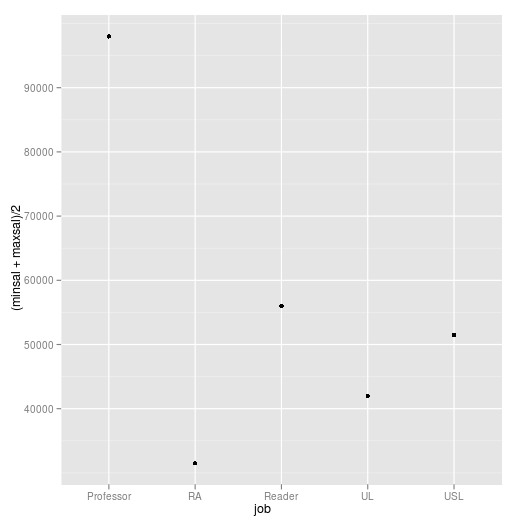
# Start with a basic plot. The levels will be in the wrong order (they'll be alphabetized), and the plot isn't really of what we want:
p1 = qplot(job, (minsal+maxsal)/2, data=salaries)
p1

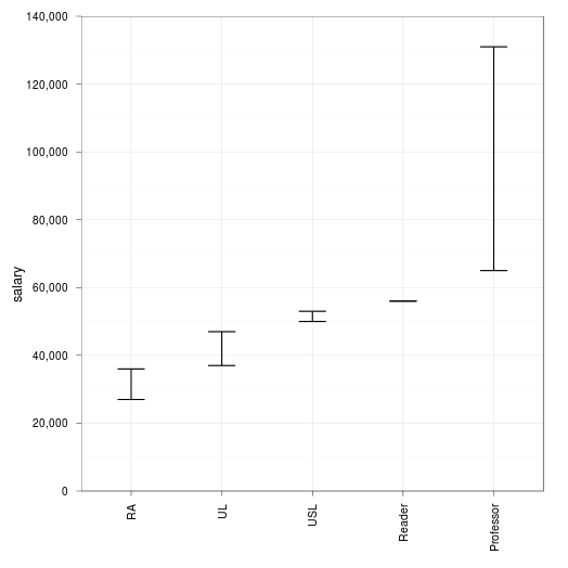
Now re-order the factor and do a nicer plot:
# job is a factor, but with its levels in alphabetical order... which will then be the order used in the plots. So to re-order them:
salaries$job = factor(salaries$job, levels=unique(salaries$job)) # arrange the levels in the order they appear first in the table

# Now let's get what we really want:
p2 = qplot(job, data=salaries, geom="blank", xlab=NULL, ylab="salary") + # don't plot any Y data in the basic plot; change the axis labels
     coord_cartesian(ylim=c(0, 140000), wise=TRUE) + # change the Y axis scale ("wise=TRUE": recalculate the visual divisions appropriately)
     theme_bw() + # make the theme black-and-white rather than grey
     opts(axis.text.x=theme_text(angle=90, hjust=1)) + # rotate the X axis text anticlockwise 90 degrees, and justify (0 left, 0.5 centre, 1 right)
     geom_errorbar(aes(ymin = minsal, ymax = maxsal), width=0.3) + # add error bars
     scale_y_continuous(formatter = "comma", expand=c(0,0)) # add commas, and have it properly zero-based
print(p2)

See also dot plots.